
This guide explains the Pantone Matching System (PMS) as an industry standard for accurate color selection in printing and design, emphasizing the use of…
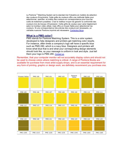
The document introduces the Pantone Matching System (PMS) as a standardized method used by designers and printers to ensure uniformity in color. It explains that PMS codes allow specific colors, such as 'PMS 280' for navy blue, to be identified consistently across different projects.
A key message of this guide is the limitation of digital displays; computer monitors cannot accurately reproduce all physical colors. Therefore, the text strongly recommends purchasing a physical Pantone book from artist supply shops to achieve precise color matching for critical design work.
Computer monitors will not accurately display colors and should not be used to choose colors where matching is critical.
The most reliable method is using a physical printed Pantone book rather than relying on digital screens.