
This document is about the visual identity manual of Ritsumeikan Asia Pacific University. It introduces the university's logo, tagline and designs.
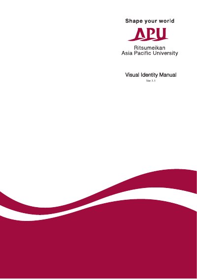
This manual establishes the Visual Identity (VI) for Ritsumeikan Asia Pacific University (APU), created to represent the collective spirit of the institution and ensure a recognizable, trustworthy presence globally. It outlines the rules and guidelines for using the official symbol mark, tagline, and designs in all communications and materials.
The document details the Basic Design System, including the official APU Color (crimson), recommended fonts (Helvetica and New Gothic), and regulations for logo variations and non-permitted usages. It also provides an Application Design System with specific standards for business cards, letterheads, media displays, and signage.
| Base Color (APU Color) | C10% M100% Y50% K30% (DIC 2488) |
|---|---|
| Recommended English Font Family | Helvetica |
| Recommended Japanese Font Family | New Gothic |
| Text Color for School Name | Black (RGB code: K100) |
The official color is called the APU Color, which is a crimson color.
Yes, the logo can be printed in gold or silver for items requiring a particular effect, such as metal name plates or award certificates.
The recommended fonts are Helvetica for English and New Gothic for Japanese.