United Nations Human Settlements Programme (UN-Habitat) releases its brand manual 2.0. The manual introduces UN-Habitat’s vision, mission, logo, usage, variants, usage guidelines, etc.
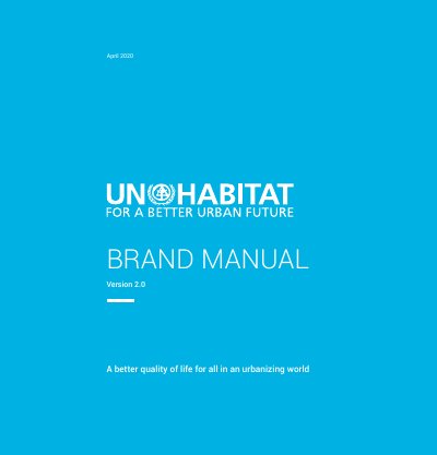
This is the UN-Habitat Brand Manual, Version 2.0, dated April 2020. It sets out how the United Nations Human Settlements Programme wants its brand applied: one brand for divisions, branches, sections, regional and country offices, projects and programmes, which are not allowed to have their own sub-brands or logos. The manual states the organisation's vision and mission and explains the brand promise, then lists the elements of the visual identity.
The visual identity is built on the logo and tag line (the logo signature), the UN-Habitat blue brand colour and the Roboto font. The document gives rules for clear space and minimum size, shows incorrect logo usage, lists the language versions of the logo and describes co-branding with partners. It closes with the colour palette, guidance on photography and credit lines, and contact details for the production team at the Nairobi headquarters.
| Brand colour | UN-Habitat blue |
|---|---|
| Blue CMYK | C 81, M 4, Y 5, K 0 |
| Blue Pantone | 306C |
| Blue web colour | #00b2e3 |
| Official font | Roboto |
| Logo language versions | Arabic, Chinese, English, French, Spanish, Russian |
The brand colour is UN-Habitat blue, with black and white as alternative primary colours.
The organisation's official font is Roboto, used in web, social media and print communications.
No. Divisions, branches, sections, offices, projects and programmes are not allowed to have their own sub-brands or logos.
It is set by the height of the letter 'U' in 'UN-Habitat' and is kept on all four sides of the logo.